BRAND MARK REDESIGN, DESIGN PACKAGE, & STYLE GUIDE
the goals
As the Brand Art Director, I spearheaded the project to revamp the Red Nose Day branding for the North American fundraising market.
My responsibilities included updating and enhancing the brand's visual elements to distinguish it from the UK operation. I infused the brand with vibrant colors, injected personality, and lightened the tone of our messaging to create a more appealing and engaging visual identity.
The new brand design now features a modernized look and feel that reflects the heart of the brand—helping children—and is strategically positioned to align seamlessly with partner brands such as LEGO and Roblox.
Site: About Red Nose Day
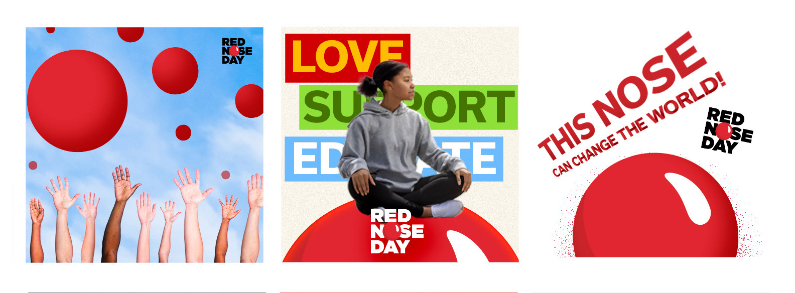
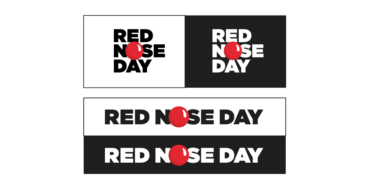
new main brand marks

the challenge
A merging of the old and the new, a comprehensive graphic design update and a fresh style guide for all brand elements. We maintained the impactful contrast of reds and blacks against white backgrounds; and while keeping the original colors, the palette was expanded. We broadened the breadth of assets, with distinct aesthetics rule-sets for Google Workspace and public-facing assets. The relaunch successfully integrated the new branding company-wide and among all trans-media efforts.
logo color scheme
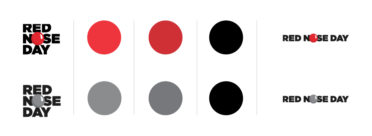
brand color usage guide

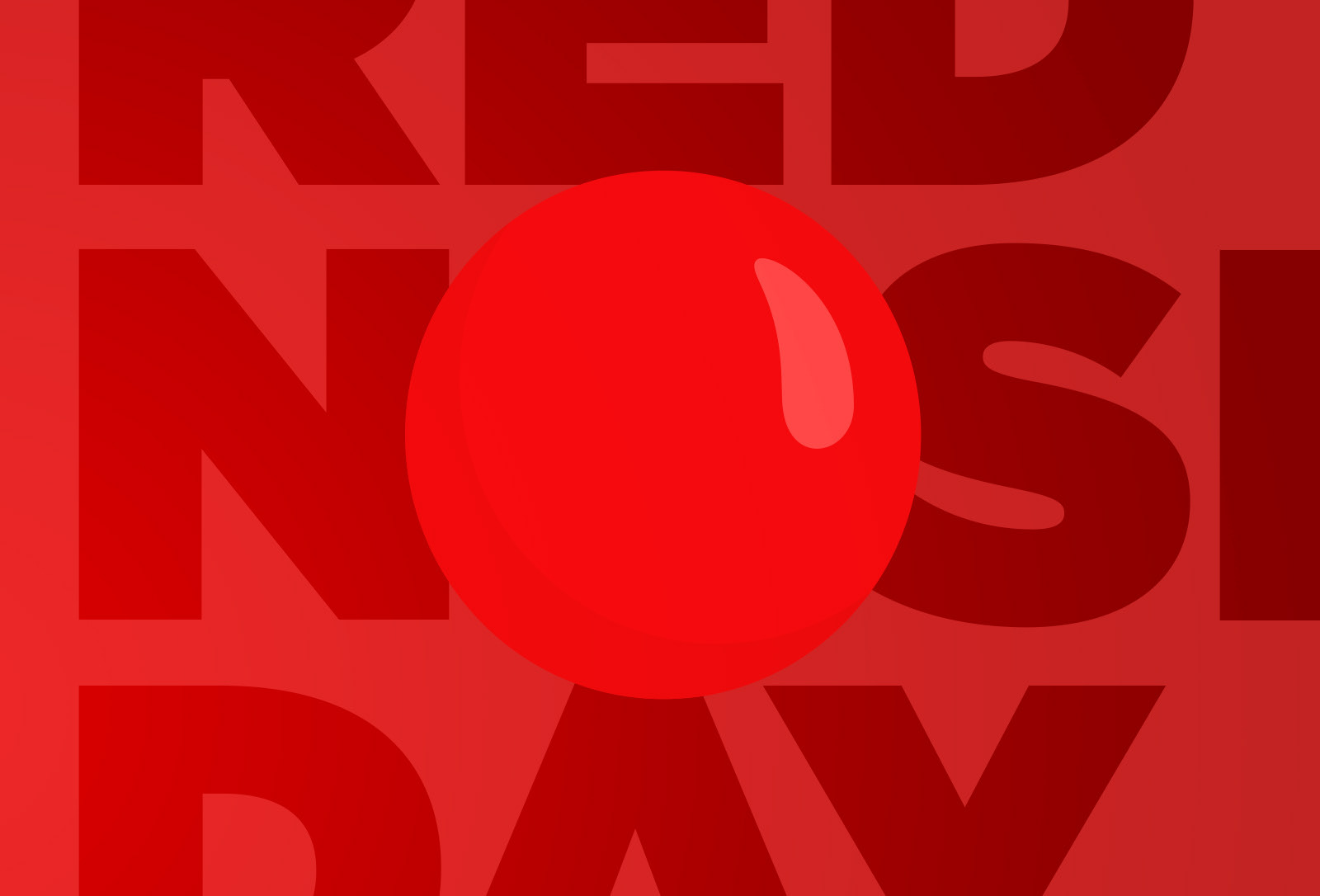
splash page texture
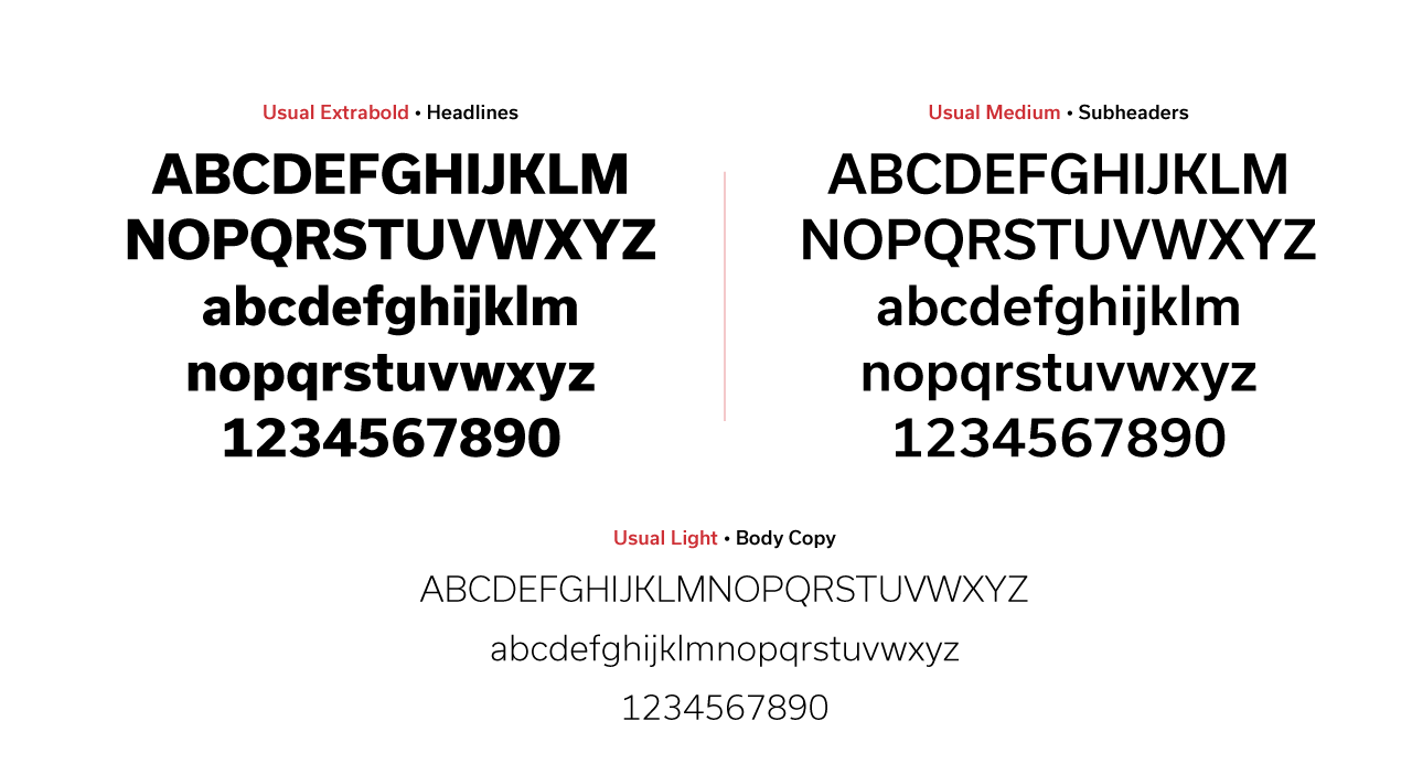
fonts
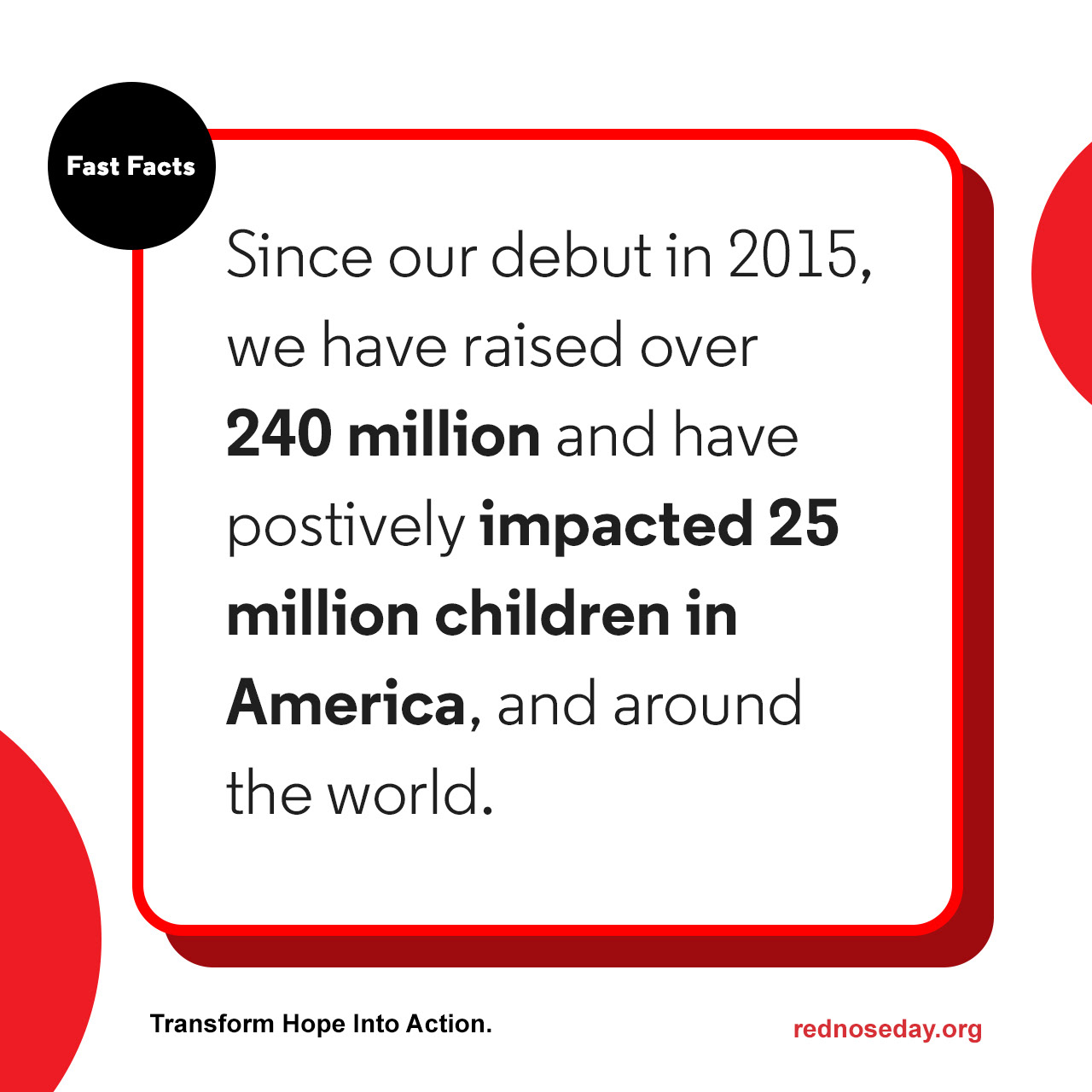
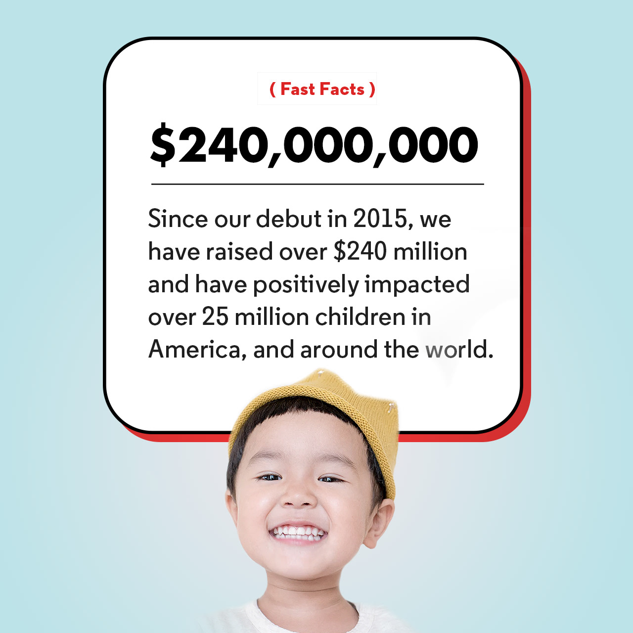
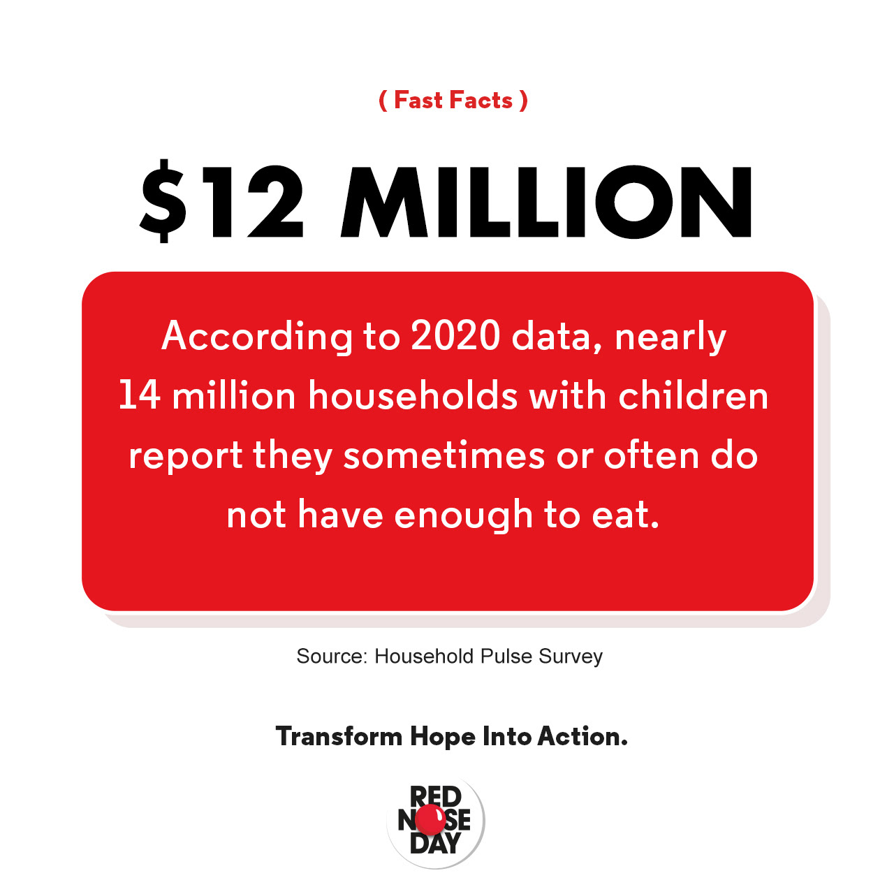
media examples